 Additional Resources
Tips for Creating Accessible Materials
Text
- Place text over a solid background (not over an image or a patterned or transparent background)
- Use sans serif font with hefty weight that provides good contrast with the background. Note that Arial, Calibri, Helvetica, Tahoma, Times New Roman, and Verdana are considered accessible fonts.
- Select a text colour that provides high contrast with the background (e.g., do not use yellow text on a white background) Consider using a colour contrast checker, like the WebAIM Contrast Checker.
- Do not use underline to emphasize text; underline should be used for hyperlinks only
- For a PowerPoint presentation, use at least 18 pt text
- Avoid using images of text; if an image of text must be used, ensure there is an alternative text format available
Headings
- Use headings to organize content; each heading should describe the content that follows the heading
- Apply headings using the built-in styles in the application you are using (e.g., MS Word)
- Use the Heading 1 just once; this heading should describe what the document/page is about
- Apply heading levels in a way that creates a logical hierarchy from the top down
- Do not skip heading levels
- Headings should not be applied simply to change the size or appearance of a block of text
Example 1: DC Connect Page
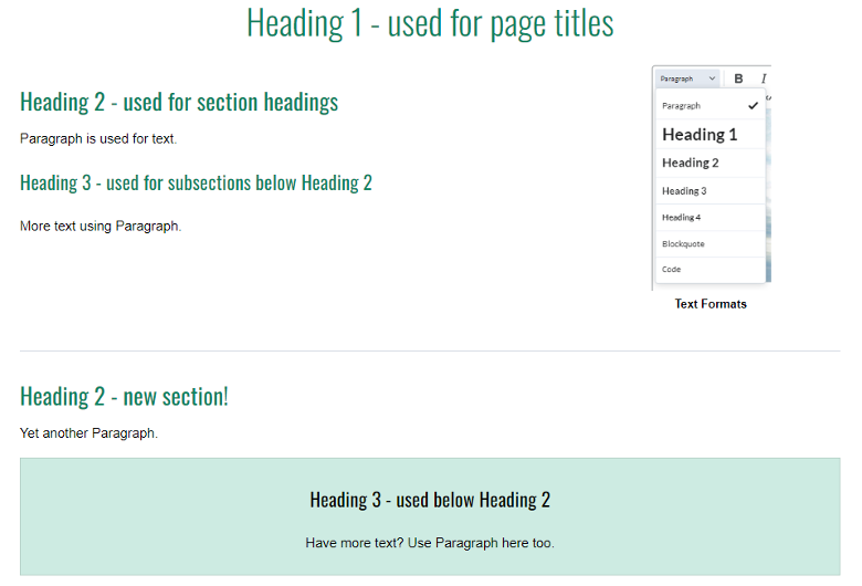
Heading 1 is used for page titles. Heading 2 is used for section headings. Heading 3 is used for subsections below Heading 2. Paragraph is used for text within headings. These formats and hierarchies are continued when using coloured text boxes to highlight key information.
Example 2: Document
-
Heading 1 (used for document titles)
- Heading 2 (used for section headings)
-
Paragraph is used for text.
- Heading 3 (used for subsections below Heading 2)
- More text using Paragraph.
-
Heading 2 (new section!)
-
Heading 3 (subsection of Heading 2)
- Heading 4 (subsection of Heading 3)
-
Heading 3 (subsection of Heading 2)
Use of Colour
- Do not use colour as the only way of differentiating information
- Use sufficient colour contrast between the text and the background
- Do not use yellow as a colour for text that is placed on a white background
Links
- Use concise link text that describes the destination of the link – do not write “click here” as the link text
- For external links, let the user know that the link opens in a new window. DC Connect will automatically inform users if a link opens in a new window; it is recommended to have links open in a new window in DC Connect to ensure they display properly.
- Specify the format of the destination of the link (e.g., [PDF], [website], etc.)
Tables
- Use tables to display information that is suitable for presenting in rows and columns
- Designate table row and column headers
- Include a caption
- Do not leave any table cells empty
Images
- Include alternative text for images that convey meaning
- For decorative images, indicate this in the image alt text
- Describe complex images in surrounding text or include a long description of the image
Multimedia
- Provide closed captions for multimedia, wherever copyright allows, and correct errors in audio-generated captions. Using DC Connect Video Note tool or Microsoft Stream allows for automatic closed-captions.
- Provide transcripts for multimedia, wherever copyright allows, and correct errors in audio-generated transcripts
- Provide a descriptive video option or another alternative format to allow those who cannot see the video display to know who and what is being shown
- Allow the user to control multimedia features (e.g., captions, when and how fast to play a video)
- Do not use effects (e.g., flashes, motion) that can provoke unwanted physical reactions such as seizures or nausea
Navigation and Design
- If a built-in accessibility checker is available in the application you are using to create your file, use it to identify and correct accessibility issues
- Ensure that users can operate any interactive elements by keyboard alone (e.g., selecting a response option on a survey)
- Reduce cognitive overload by 'chunking’ information into sections, with appropriate headings
- When creating bulleted lists and numbered lists, use your application’s built-in tools to create these lists
- Allow users to control functionality of multimedia wherever possible (e.g., ability to turn on/off closed captions; start, stop, adjust the speed; pause a video)
External Accessibility Resources
Ontario Government
- Proposed postsecondary education standards – final recommendations report 2022
- Accessibility for Ontarians with Disabilities Act (AODA)
- Ontario Human Rights Commission
Council of Ontario Universities
Web Content Accessibility Guidelines 2.0
- WCAG 2.0
- WCAG 2.0 Quick Reference
- Web Accessibility Initiative Tutorials
- Web AIM Web Aim Accessibility in Mind
Other Postsecondary Resources
- Essential Requirements Paul Menton Centre, Carleton University
- Understanding Essential Requirements Centre for Teaching Excellence, University of Waterloo
- Accessibility Hub Resources McMaster University
- Accessibility Digital Content Training McMaster University via Open Library eCampus Ontario
- Accessible U. Start with the 7 Core Skills University of Minnesota
- Ontario’s Universities Accessible Campus - Overview: Accessible PDFs